Vocaby

Role
Discovery, UX Research, Sketch, Wireframe, UI Design
Vocaby
Case Study
App for learning vocabulary.
The user can create new folders and add words to them even offline.
About the Vocaby
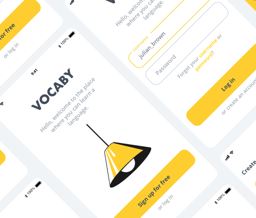
Vocaby is an application for creating your own flashcards. It helps you rembember new words that you have learned, for example, while reading a book or while watching a series in a foreign language. Works offline so you can study anywhere in the world - long fly is great moment.
Challenges
I needed to create an application in which the target user can easily add newly learned words, create separate thematic folders and return to them at any moment of the day. The Vocaby must run offline.
High-level goals
- Ability to create folders in which there will be words added by the user.
- The application must runs offline.
Design process
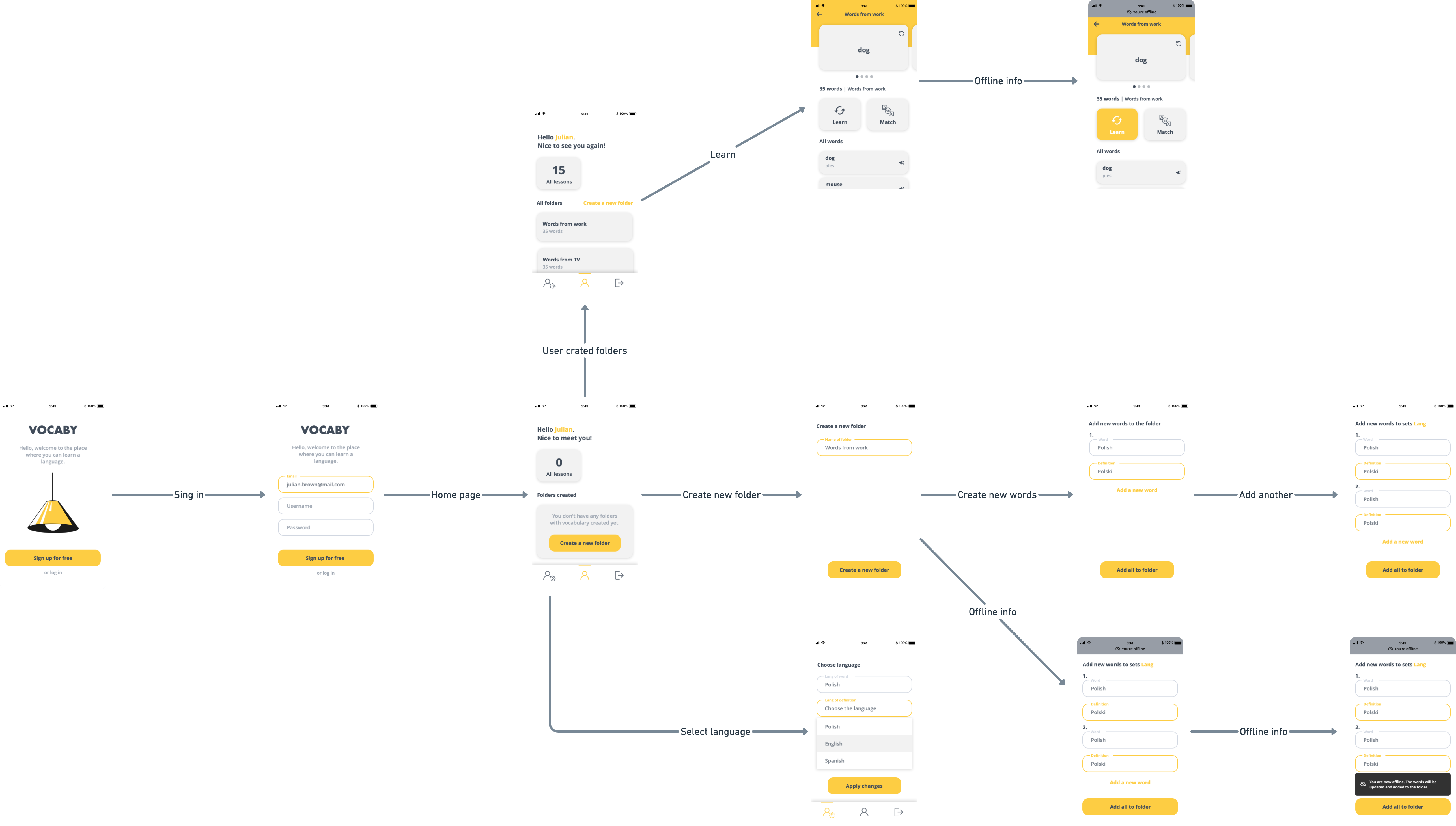
The first step of the design process involved interviews and desk research to understand how competitors and users behave. I believe it's important to get this information early on in the process, before having an idea or prototyping. After analyzing this insights, I began to conceptualize the solution, focusing on user flows and wireframe to give me a way to iterate faster through ideas.
Before interviews with users, I wrote a 5W method for Vocaby:
- WHO - The age range for the target audience could be teeneger from 12 years to 18 years old. 20–45-year-olds learning more, improve their level. They also could be 45–65-year-olds learning online or improving their English at home.
- WHAT - A mobile application focused on learning new vocabulary in a foreign language. An application that allows you to add your own words
- WHEN - The most important goal of this app is to have it at hand, to be able to add a given word at any time. This app is designed to be used on the go during quick 5-10 minute learning sessions. Users could use it on the train, during a lunch break or even at bedtime.
- WHERE - Location and context will ultimately depend on the target users. This could be while listening to a podcast, watching a new show, or reading a book.
- WHY - Users want to have newly learned words at hand, they want to be able to add them in one place and check their learning progress.
Personas
I started by creating a provisional persona to summarize my assumptions about the user. I used it to guide my research, understand my users’ goals and needs, and relate my findings to Vocaby overall mission.

Woman, Teacher, Cracow
Anna works as a math teacher at school. She often reads articles in English during breaks from work. Anna writes down new words in a notebook on her phone or on a piece of paper that she has at hand. She needs a phone application where she can jot down words which she can return to before going to bed or in the morning at breakfast.
- She want to have an application that is always at hand on my phone.
- She would like to improve her language and remember more words.
- She is annoyed that she loses her notes and that they are not in one place.
- Sometimes there is no coverage in the school.

Woman, Pension, Cracow
Maria would like to improve her English language because her daughter lives abroad where Maria's grandson is being brought up.
Maria learns new words most often while reading the books she gets from her daughter and watching movies in English.
She writes down words in a notebook, but she admits that she already has a lot of them and that it is difficult for her to find herself in them. Needs one place to write down words.
- She wants to improve her vocabulary for the sake of family abroad.
- She wants to have all the words at hand in one place.
- She is irritated by a mess in her notes.
- She is losing vocabulary notes.

Boy, Student at school, Cracow
Jack is a teenager who studies at school. He is very interested in animals, he reads many books - Polish but also in English.
After school, he often commutes to extracurricular activities. Then he only takes his phone and a bag for classes with his favorite book.
It happens that he often leaves the house without a notebook - then there is nowhere to write down the words he has learned.
- He wants an app on his phone to write down words.
- Wants to become a vet in the future.
- It annoys him that he often forgets his notebook and has nowhere to write down the words he has learned.
- He loses his notes with the words.
User interviews are a core user experience method. That’s why I chose to approach 10 people to interview, taking into account the recommendation from Donald Norman’s article, “Why You Only Need to Test with 5 Users,” noting that it is possible to learn about 80% of the errors, problems, and behavior from the first 6 users. That would bring enough data and inputs to generate concepts and hypothesis.
Interviewed audience
The interview sample took into men, women and children aged from 12 to 65, wanted to learn new language of city Krakow, and with different learning habits.
The interview took approximately 30 minutes and included topics to get to the core of what users are trying to do and what their problems are.
So I asked:
- Where do you learn new words?
- Are you currently saving them somewhere?
- Are you going back to them? Sometimes?
- When do you prefer to repeat new words?
- How much time do you currently spend on vocabulary revisions?
Customer Insights
After analysing the interviews, this was the most relevant information for decision-making in creating the solution:
We can see that although 90% of users write down words somewhere in a notebook or on a piece of paper that can be handy, as many as 65% of users do not return to these notes ensuring language improvement. 75% od users learn new words from movie, series or book.
Desk Research
I researched data and habits related to other current application to learning words. The goal was to understand how competitors behave and benchmark.
Duolingo instead of building a classroom-style product in an app, took cues from the world of gaming to enhance the experience and keep users engaged. Users can compete against friends and random people by completing courses, and receive rewards for streaks. Duolingo also separated itself from other language learning services by using data to its advantage. It regularly runs tests to find an optimal way to design a course, testing users on how quickly they learn part of the language and changing the formula to smooth the learning curve.
Quizlet is one of the most popular online learning services in the United States. The platform provides tools and activities for students to learn and study. Of particular interest is Quizlet’s “Learn” activity, based on the principle of active learning rather than passive learning. Active learning has been shown to increase long term learning performance and retention. Quizlet Learn refines the active learning process by using a user’s previous performance to set the difficulty and repetition of future questions. I set out to explore possible feature enhancements to Quizlet Learn that might increase the overall effectiveness and engagement in this activity.
User Interface
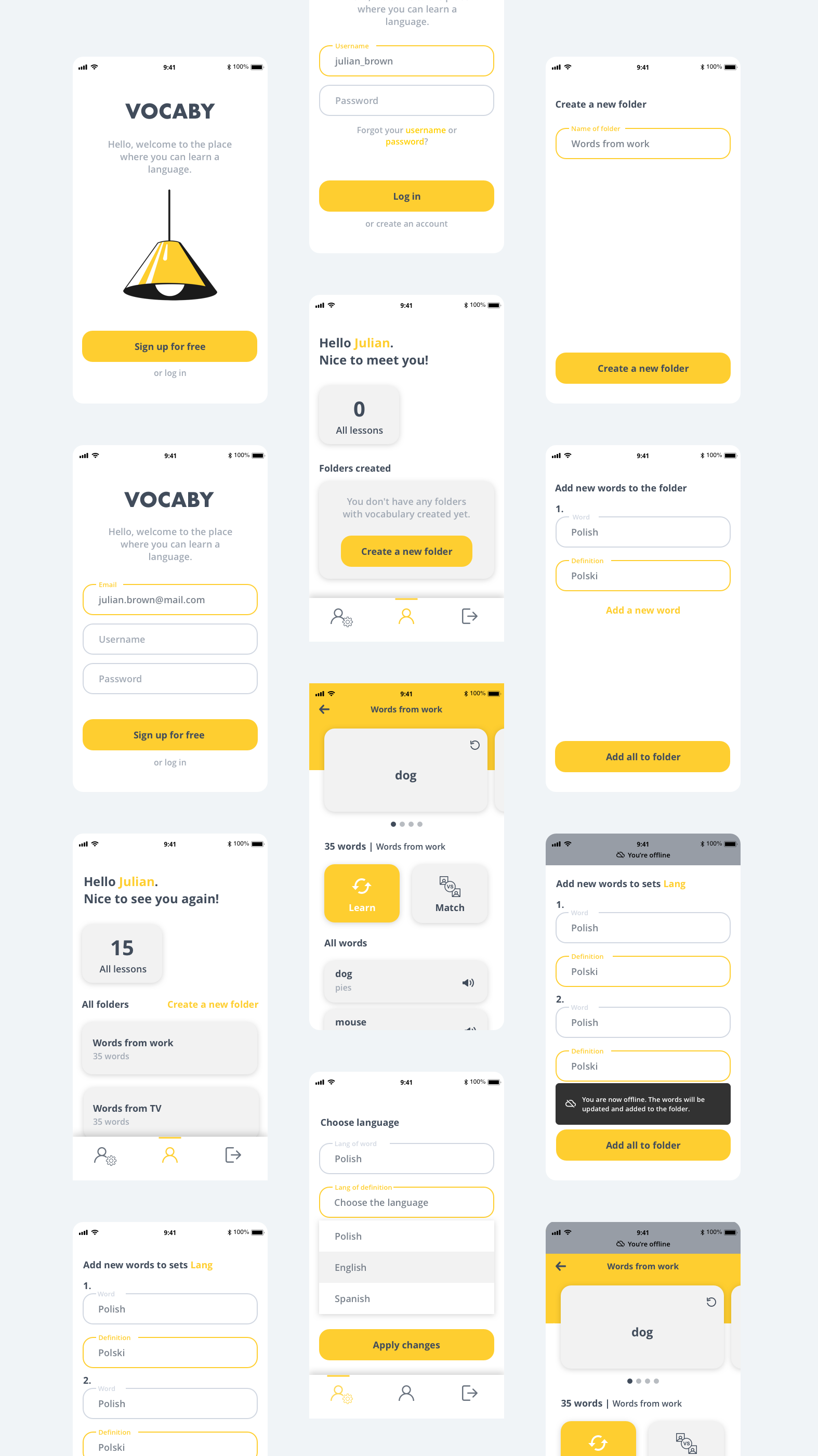
I sketched screen options while keeping in mind the target user, the learning goals, and my goal for the app to run offline.

The brand’s guidelines led us to pick a playful and inviting tone, so we chose yellow and gray as well to give the interface a warmer look. For text, a much darker variation of purple has been brought in to ensure reading and contrast, thus reaching appropriate levels of accessibility.
Colors
Typography
Design
Dashboard is divided into "Home", "Settings" and "Log out", the last one option being the place where the user can leave the application.
The information at the top shows how many sessions have already been performed. This will encourage the user to learn more. Personalization was also used, the username provided during registration to the application is added.


Offline state
The main goal when creating Vocaby was to be able to learn and add newly learned words anywhere in the world - offline mode was needed.
I was wondering for a long time how to rearrange this information on the interface to make it understandable for the user.
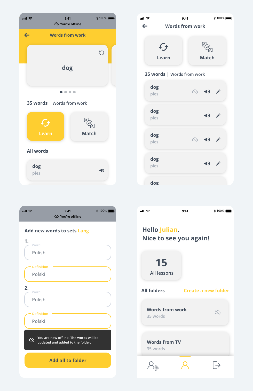
When adding a new folder or new words - the interface shows a text message that the application is offline. This information appears on the gray bar at the top of the application - a color change suggests that the application is not working as usual. There is also a "bubble" with a text message that disappears after a few seconds.
The offline icon appears on the list of added folders and words - this is information for the user that the folder or word has been added to the list and will be updated when the application is reconnected to the Internet.
The user does not worry if the word he has just learned and added to the application - has been correctly added to his folder because he received a message that despite the fact that the word is offline, the word has been added to the application improved.

Summary
There are plans to expand the Vocaby application. In the near future, the company's website will be created and we will be working on a desktop version of the application that will be connected to the translator. We also want to introduce gamification.
← Back to main page