Case 04 · Style Guide
Building a style guide for a growing product
A system effort to unify tiles, lists and shared interface patterns across a product that had grown for years without one source of UI rules.

About the Style Guide
All teams in the organization worked for many years without detailed documentation and guidelines on what and how it should look like. This led to visual discrepancies between projects and a lack of clarity for new team members.
Challenges
The biggest challenge was to catalog the elements of the application, which has been in existence for over 10 years, and to harmonize the elements so that they fit together. We wanted to find one type for each UI element.
High-level goals
- Gather all existing components that the application is currently using.
- Consistency of the interface elements that require it.
- Create a complete Style Guide with the guidelines outlined.
Design process
Why did we need the Style Guide?
The application has been around for over 10 years. During this time, it has grown significantly. We realized that the appearance of the application is no longer consistent. There was not one single place to check the interface guidelines when developing new features, which raised a lot of questions and a chance of duplication.
We had over 60 unique colors throughout the application. Most of them were very similar in terms of value. I found this was because the developers were using the dropper to extract the color the designer had used in the mockup. 🤔
Popular styles such as buttons have been copied from one style sheet to another, or worse, recreated with different variations on the same style sheet. There were situations where even the styles on one page did not match 🤦🏼♀️. The UX patterns were very different across the site, which led to user confusion.
We felt it was time for a change. Our current practice was neither sustainable nor scalable. We needed the Style Guide. 🦄😎
At the beginning, I conducted a thorough review of all components that are used in the application. During this stage, I found various monsters hidden in the depths of the app. I wrote down my observations and found elements that differ. I have created a document with the currently used processes, functions and components of the user interface. I looked through all the nooks and crannies of our application. Here is one page of this document:
Application map.
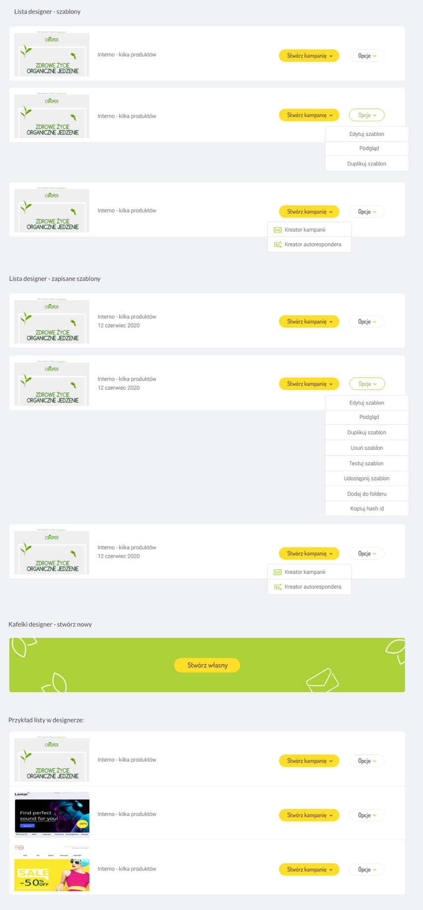
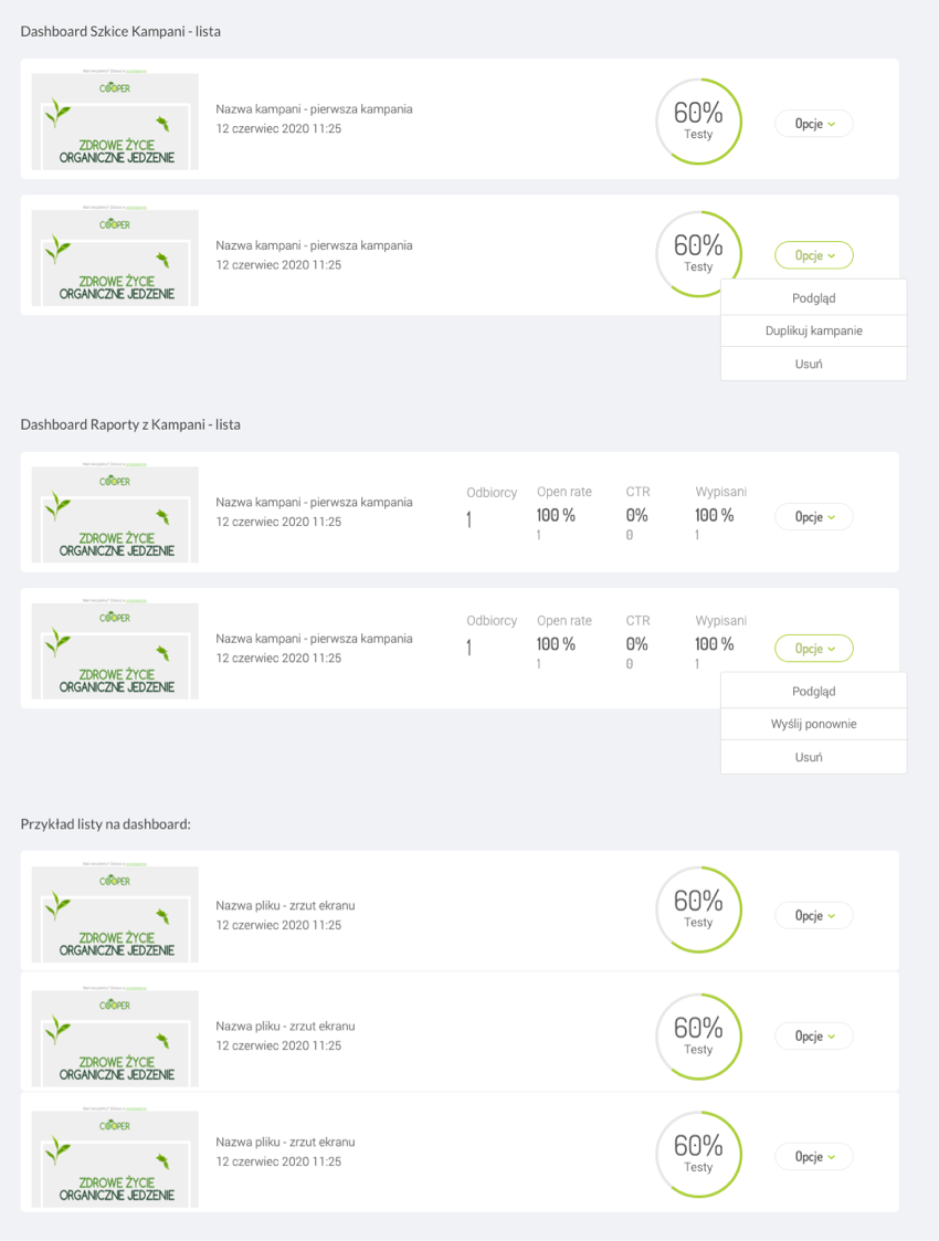
I already knew which elements needed to be redesigned to make them consistent. For example, we had 4 different tiles and lists that differed from each other in appearance and behavior.
During the entire Style Guide project, I dealt with, among others: cataloging all buttons and their states, the rules of the search engine, unifying all types of tiles and lists in the application, new menu, validation of inputs, colors, fonts, notifications, bars, modals, switches, checkboxes , blank screens, etc.
In a case study, I focus on the process of making the tiles and lists consistent. As I mentioned before, there are four different types of them, which in theory are supposed to do the same, but they look different. This was because the newly added features were created by other people and the Style Guide did not exist.
Tiles collected differed from each other - they were supposed to do the same, and each of them looked different. With one, only after hovering there were actions, which was a very bad idea. The user must have guessed that there might be things hidden somewhere that he needs. 🤔
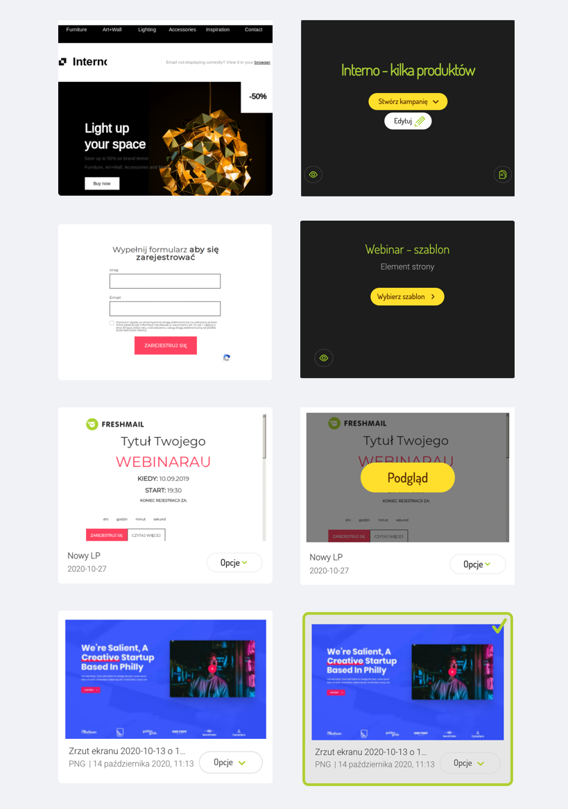
Different types of tiles in the app.
First, I thought about what functions on tiles and lists are consistent for each type. I wrote down all the combinations. I proceeded to the sketches. The most important thing for me was that the look of the tiles and lists were consistent so that one universal look could be applied to the entire application, both now and in the future.
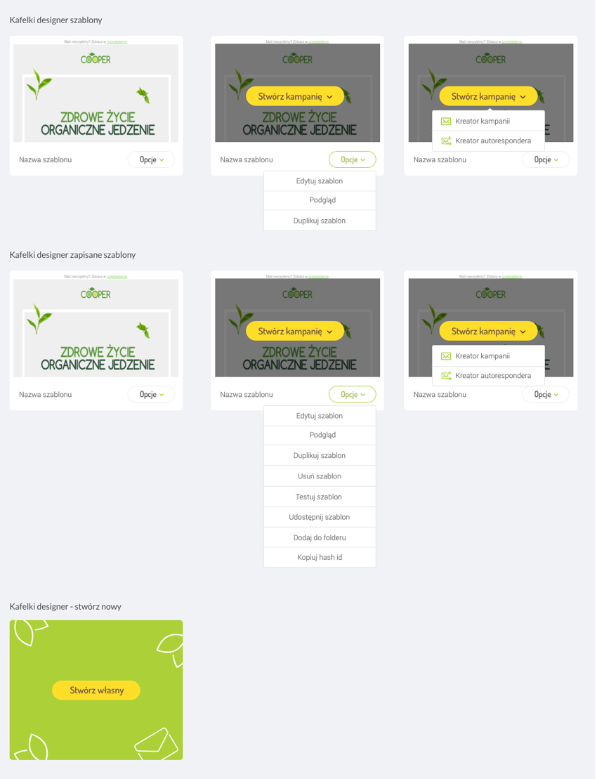
Unified tiles in the app.
Unified tiles in the app.
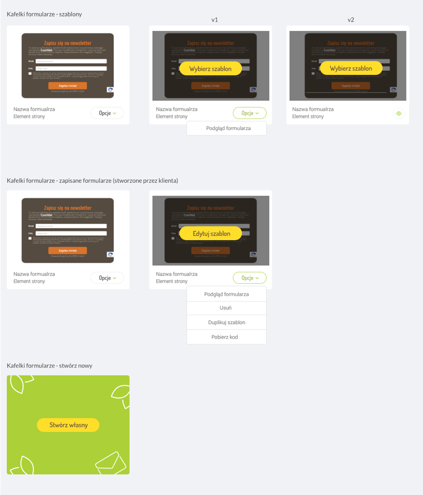
Unified tiles in the app.
There was also created a tile that is consistent for all types of tiles for adding or creating new things, e.g. email campaigns. Previously, it appeared for each option in a different form. It was getting a mess.
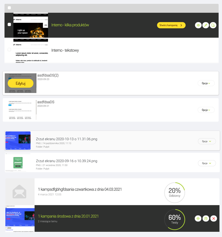
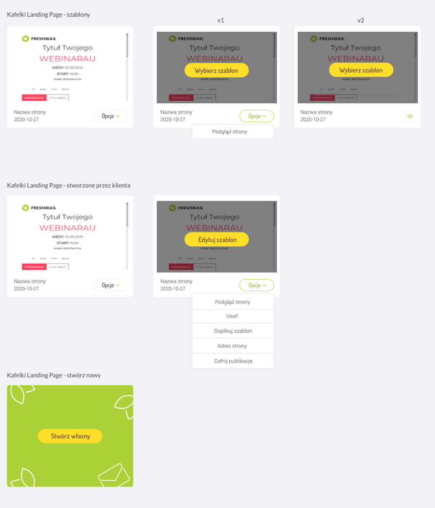
Various types of lists in the application.
One version of the list was very old and had a very bad design. All actions were hidden and only appeared after hovering over with the mouse. It was similar with the tile counterpart for this type of list. For the user, this is confusing, as from the beginning he should see what he can do with the item in the list without thinking that perhaps some options will appear on hover.
Unified appearance of the list in the application.
Unified appearance of the list in the application.
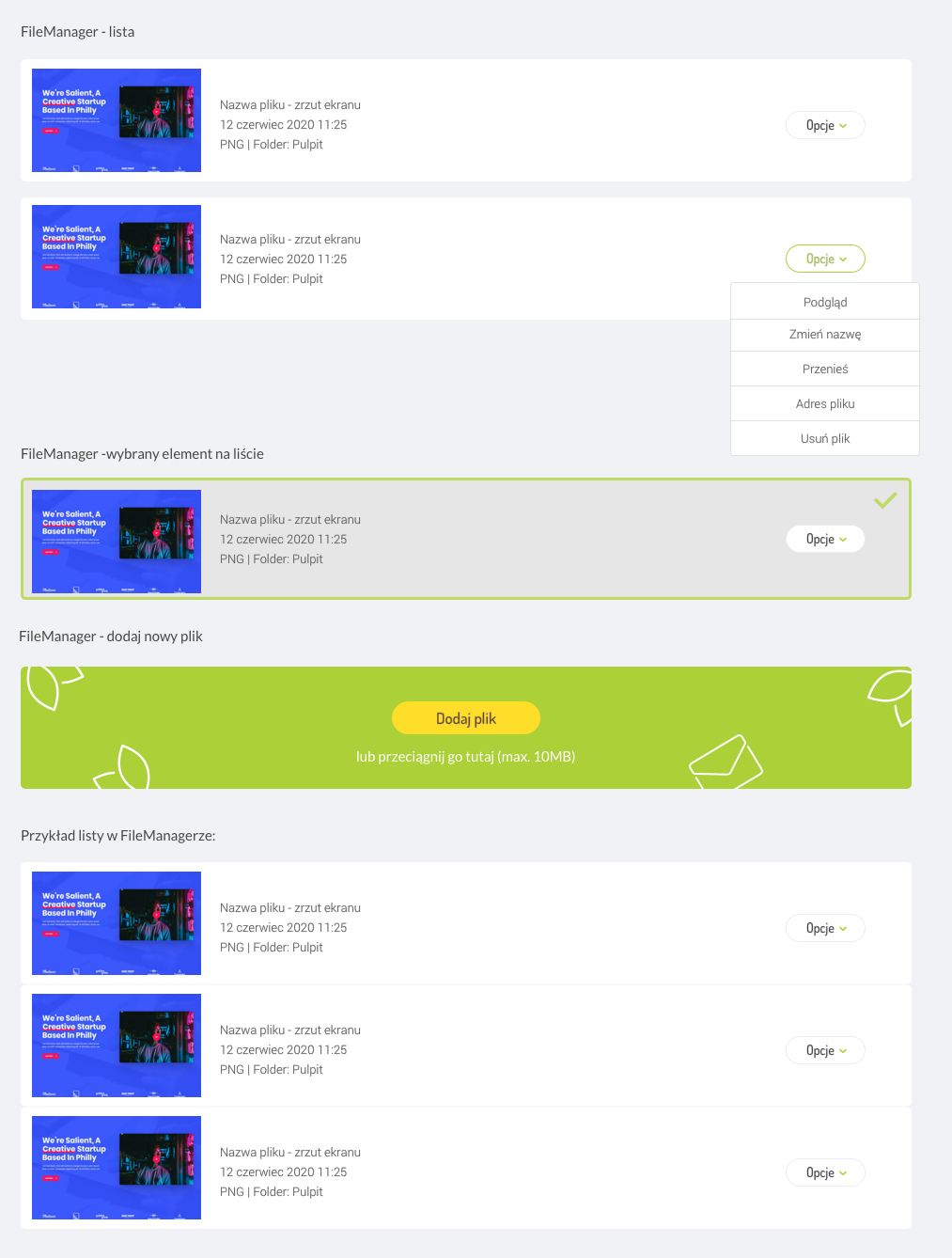
Unified appearance of the list in the application.
Summary
Preparing a Style Guide for an existing application is quite a challenge, consisting of very tedious work of browsing all views. With the application documented, designing consistent elements was the easier part of the task. Having a set of UI elements, everyday work becomes easier, because every developer can choose the right components without any doubts.
Style Guide is a must have for companies that want to efficiently develop their systems and create a consistent, beautiful interface. ✨
← Back to all case studies