Rethinking pricing
Role
Research, Wireframes, UI Design, Prototyping, Usability Testing
Rethinking pricing
Case Study
Change of the pricing user interface for the new way of payments method.
About the price list
The main business goal was to introduce plans instead of paying in advance and taking out loans. It was necessary to completely change the method of billing and create a new user interface.
There was also a need for a website that would be a summary for the client - his current plan, additional services and other possibilities he has on his account. The important thing was to design the new interface to match the rest of the application that has been around for over 10 years. I also wanted to add some freshness.
Challenges
The biggest challenge was to design a new price list so that all business requirements were met and that the presentation of new plans on the interface was legible for the user.
High-level goals
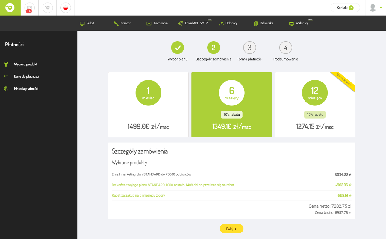
- Change the method of settling accounts with customers and introducing plans to the price list.
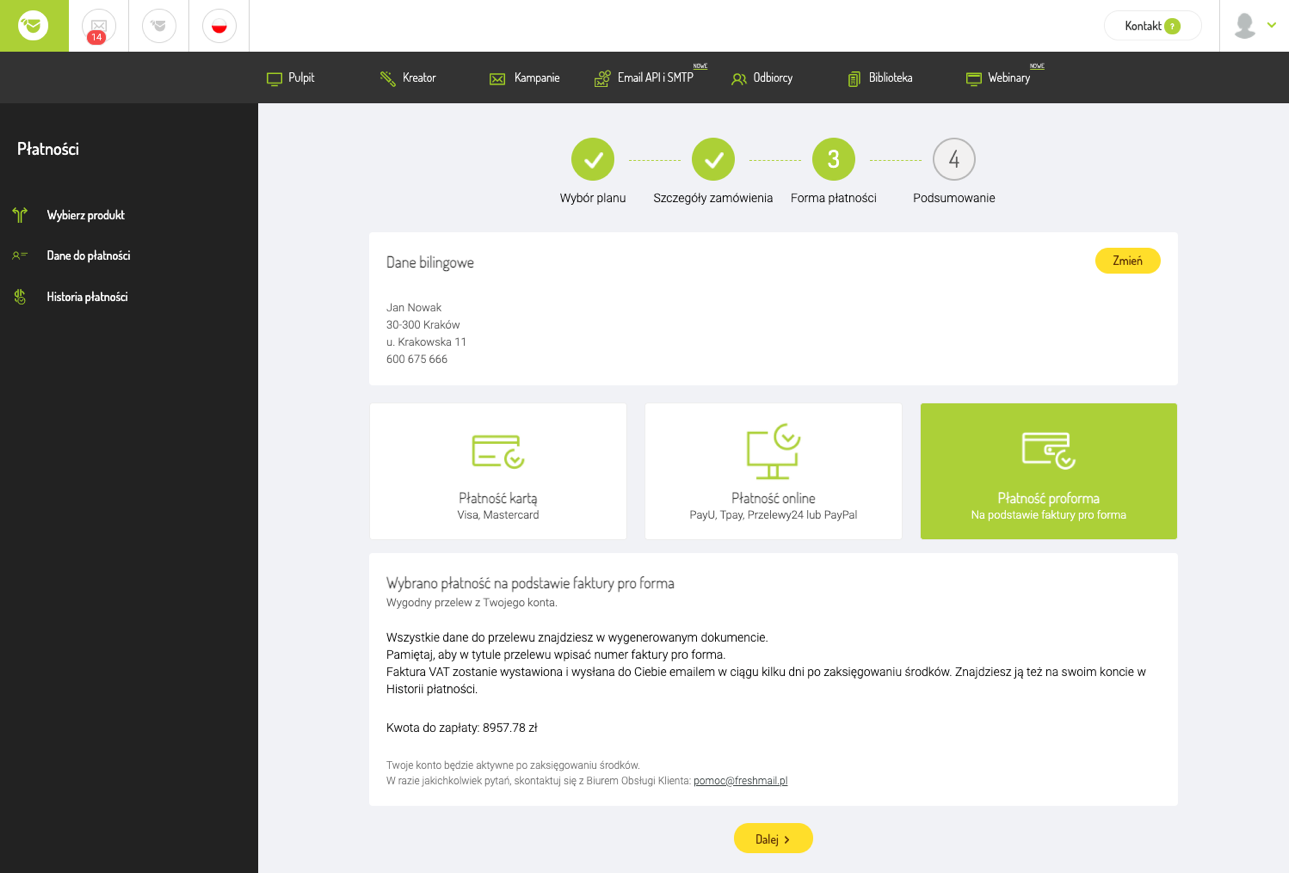
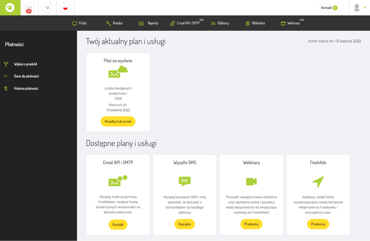
- Dedicated page in the "Your plan" payment summary.
- New user interface to match the rest of the application.
Design process
At the very beginning of the design process, I started by writing down the business requirements that had to be met in order for the project to be successful and that I could come back to it at every stage of the process and make sure that I was going the right way.
I wrote out the user's path, from the moment of choosing the plan to payment, thanks to which I was sure that each path would be covered with the appropriate view and action.
In the next step, I started a detailed benchmark of the competition - I was interested in what the purchase path looks like, how the plans are resolved in the price list and how to buy additional services.
I created a document in which I wrote down the most important observations from the benchmark, I also put there the inspirations I found during this task. Persona was created by another member of the design team. This was analyzed with the rest of the team at the next product meeting. I already had the initial outline in my head. I started creating a mock-up lo-fi.
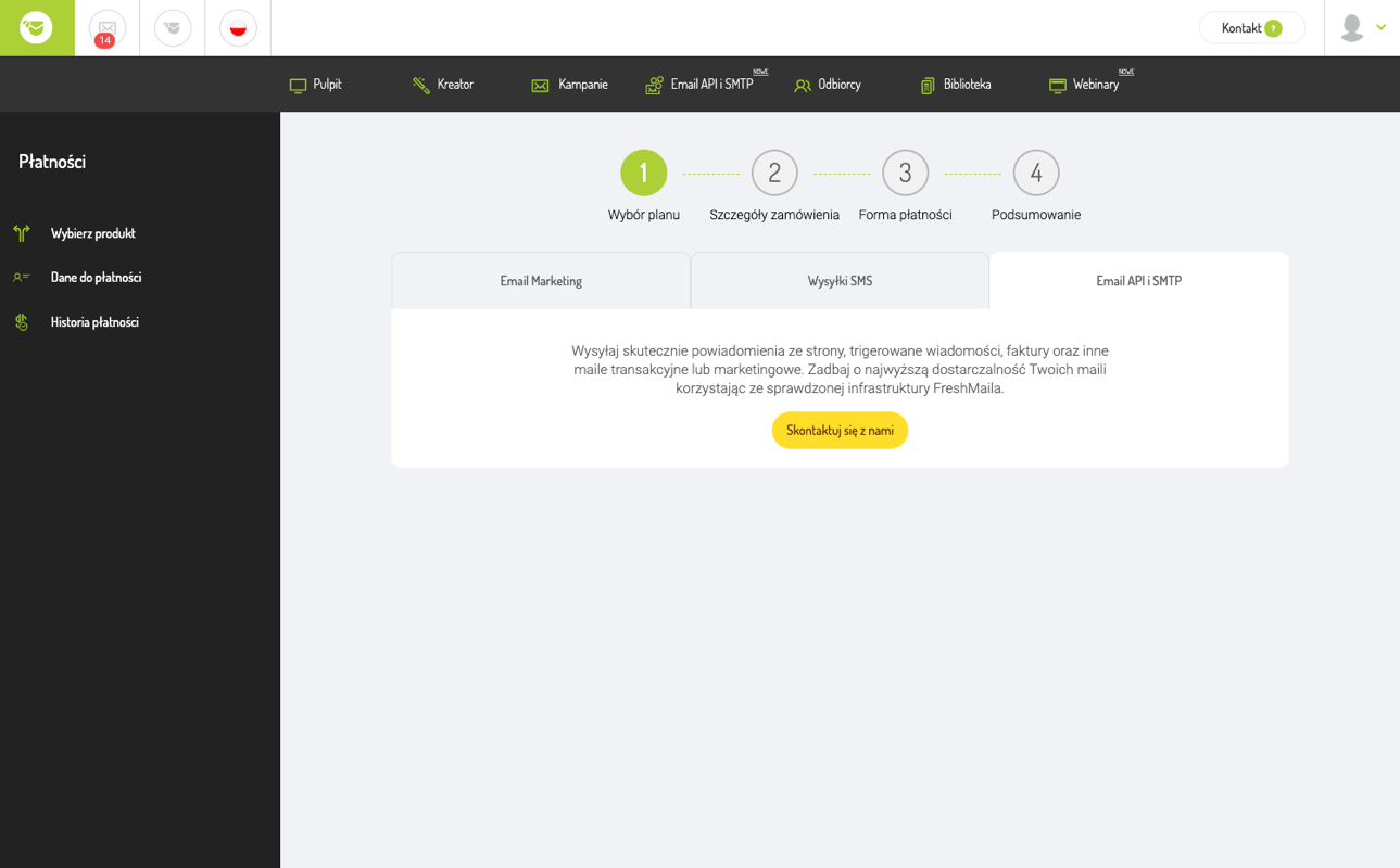
Below I present what the price list looked like before the changes (it was possible to buy only two options, there was no division into plans and additional services) and a preliminary mock-up that presents an outline of the new price list interface.

I came to the conclusion that instead of the buttons that are placed on the outline of the mock-up above the selection of plans, visual tabs should be used, which will allow the user to find their way on the website more easily and to understand the principles of operation more easily. It gives you the feeling that what you are choosing is a whole - integrated with what is below.
I've also added steps on every page in the price list from selecting plans to paying. They inform the user what is happening at that moment and how many steps are left. The user feels that he is not stuck, but with each step it comes to the end of the transaction and purchase of the plan.
It was a huge challenge to design the new interface to be nice and modern to match the rest of the application that has been around for over 10 years. I wanted to avoid the effect that the new price list interface stands out from the rest of the system - it is too modern. I wanted our users, who have been with us for years, to feel familiar to them when they enter the new price list.
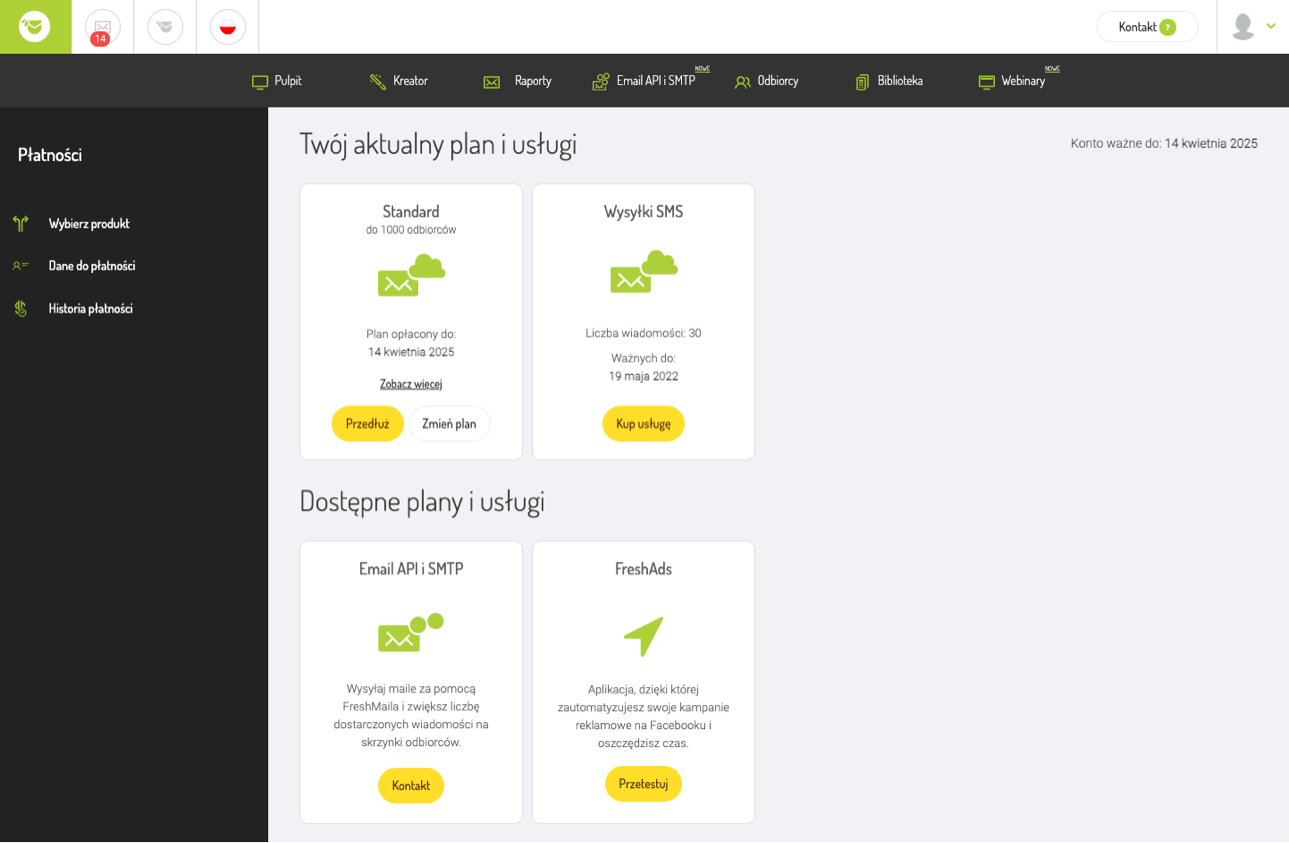
We also needed a dedicated page with a summary of the plans and additional services purchased by the user. The "Your Plan" page was created, where the current plan and additional services of the user are placed. From this page, you can easily change the current plan or extend it for another period.
The user, depending on the main product on the account, has various options and purchase combinations for additional services. On the website, they can find the expiry date of their plan and any additional services they purchase.
Summary
The end result not only meets the business requirements, but also introduces a freshness in the appearance of the application, opening the way for further changes. Good knowledge of the application allowed to create new views in a consistent style, without introducing duplicate elements. Good cooperation with programmers is also important so that the proposed solutions can be implemented on time.
The final verdict of the interface always belongs to the user, so I waited impatiently for the sales statistics, which confirmed our expectations. 💸
← Back to main page