01
Problem
Support information, help content and feedback options were available, but users had to understand which path matched their need. Contact details, help-related questions and feedback were not clearly structured around user intention.
Case 04 · CONTACT & FEEDBACK REDESIGN
Turning a static contact area into a more structured support experience with clear paths for direct help, self-service answers and product feedback.
Users entered the support area with different goals getting technical help, finding answers or sharing feedback but these needs were mixed into disconnected experiences. The goal was not simply to redesign screens, but to create clearer paths that reduced friction and helped users reach the right action faster.
Support information, help content and feedback options were available, but users had to understand which path matched their need. Contact details, help-related questions and feedback were not clearly structured around user intention.
Create a clearer support experience that helps users quickly decide whether they need to contact support, find an answer on their own or share a product idea.
A redesigned support area with two main tabs: Contact for direct support and company information, and Help for FAQ-based self-service. Feedback was separated into a dedicated flow with clearer motivation, input and confirmation states.
Research, UX/UI, IA, AI-assisted prototyping
iOS, Android
Support structure, FAQ patterns and feedback flow.
The previous support experience treated contact information and feedback as static screens rather than connected support journeys. Users could enter this area with very different needs: they might want to call support, check opening hours, find an answer quickly, locate the company or suggest an improvement. The challenge was not only to make the screens look cleaner. The key design problem was to structure different support intentions in a way that felt simple on mobile, reduced decision effort and made the next step obvious.
Main issues included:
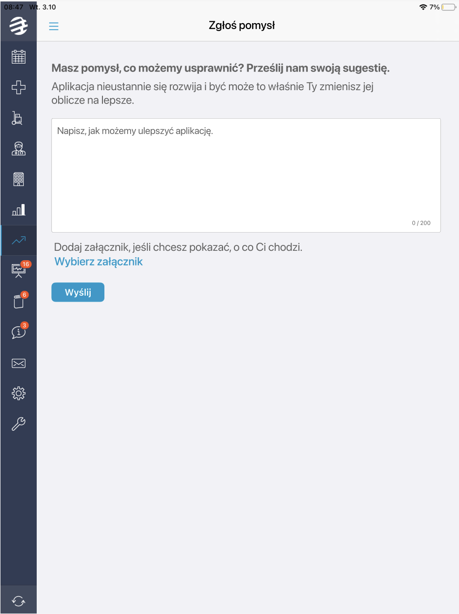
Feedback form before redesign.
The form collected input, but did not explain why sharing an idea was worth the effort or what would happen after submission.
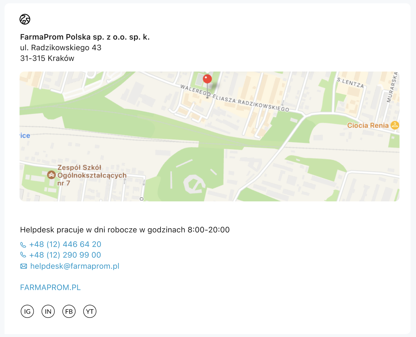
Contact screen before redesign.
Key support information was present, but users had to interpret availability, scan multiple contact options and decide the next step on their own.
My work included analyzing the existing experience, understanding support behaviors, restructuring information architecture, designing flows and adapting solutions across iOS, Android and tablet. I started by reviewing the current experience and exploring how modern products approach support interactions. I looked at patterns around self-service, support accessibility, contextual states and feedback mechanisms.
At an early stage of the project, I used Claude to quickly move from requirements into interactive prototypes. Instead of starting with static screens, I created clickable flows that could be reviewed and discussed much earlier in the process. This helped the team validate ideas quickly across both platforms, compare alternative approaches and identify potential implementation constraints before investing time in more detailed design work.
AI accelerated the transition from requirements to testable concepts, while design decisions and iterations were driven by product logic, user needs and team discussions. Rather than treating Contact as a static information page, I approached it as a product experience with multiple user goals and decision points. The goal was not simply to redesign screens, but to create clearer paths that reduced friction and helped users reach the right action faster.
AI helped move quickly from requirements to interactive prototypes that could be discussed and validated early.
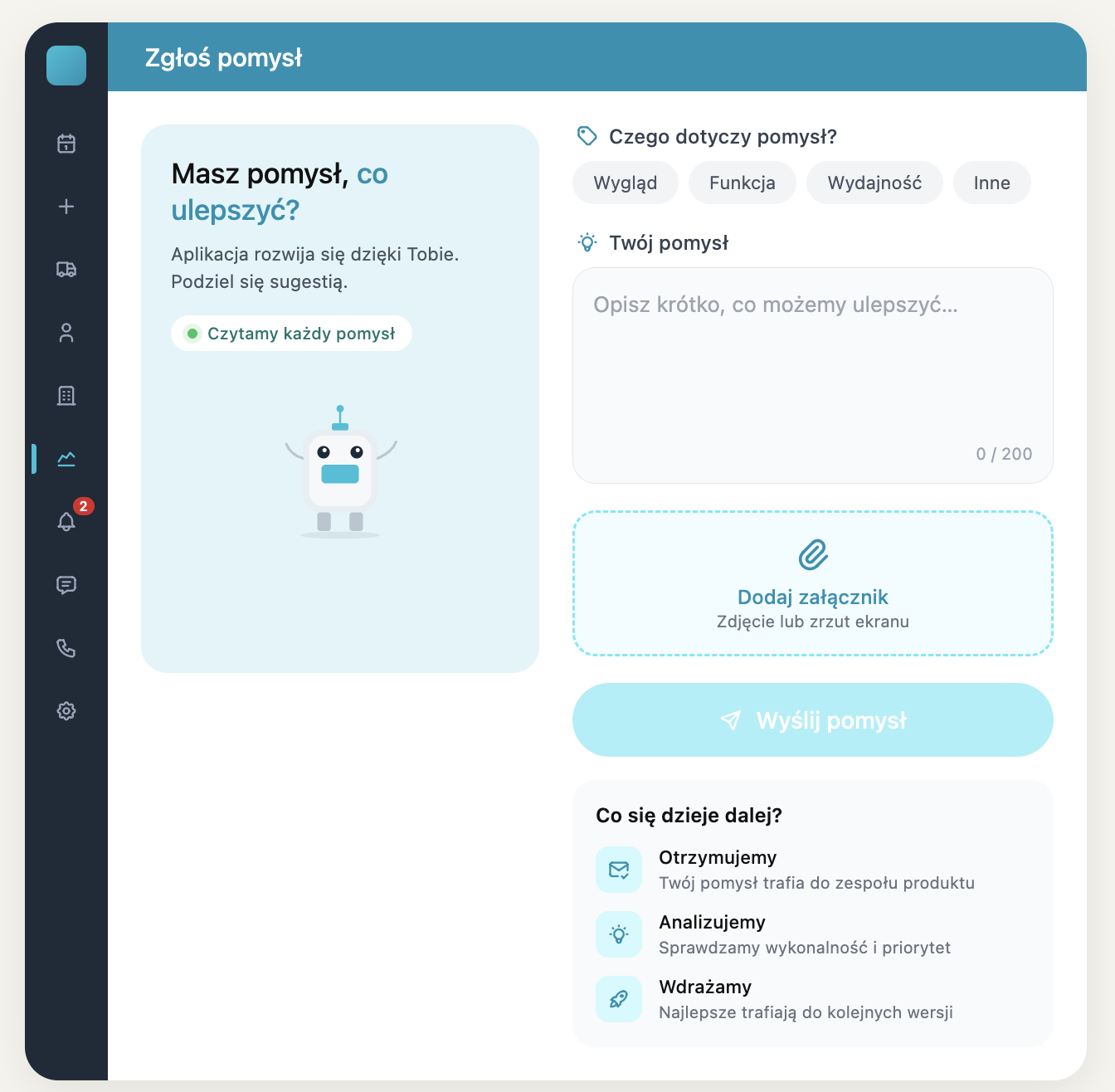
Early AI-assisted clickable prototype used to validate ideas and discuss feasibility.
During analysis I noticed that users were entering the same area with completely different expectations. Three recurring intentions emerged:
Time-sensitive situations where users need a visible phone action, clear availability and basic company information without searching through the interface.
Repetitive questions that can often be solved through a lightweight self-service layer instead of direct contact with helpdesk.
Moments where users notice something that could be improved and need a low-effort way to send feedback with clear expectations about what happens next.
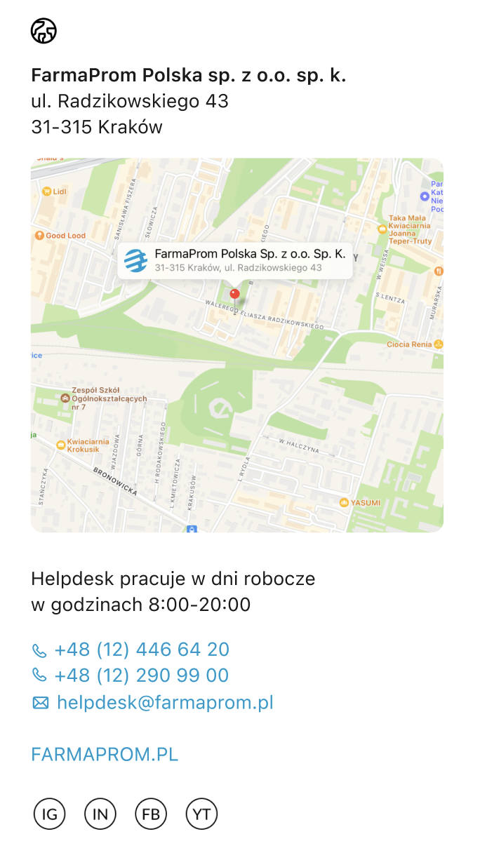
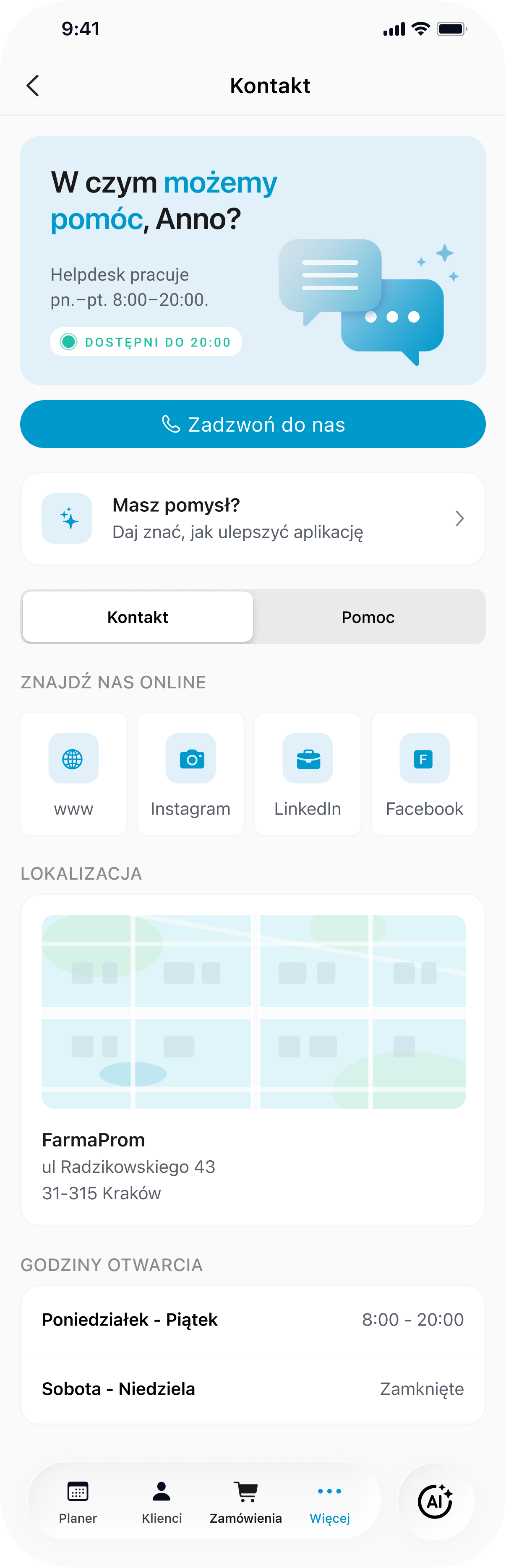
Separating direct contact, self-service help and feedback reduced ambiguity and helped users choose the right support path faster.
Instead of showing all support-related information in one long static view, I organized the main support area into two tabs: Contact and Help. Contact focused on actions and operational information, while Help became a dedicated space for frequently asked questions.
This made the structure easier to scan and reduced the need to interpret which information was relevant to the user’s current situation.
The phone CTA remained visually dominant because contacting support is often the most urgent user need. Even though the page contains additional information, the main action stays easy to find and easy to trigger.
This helped turn the contact screen from a passive information page into an actionable support entry point.
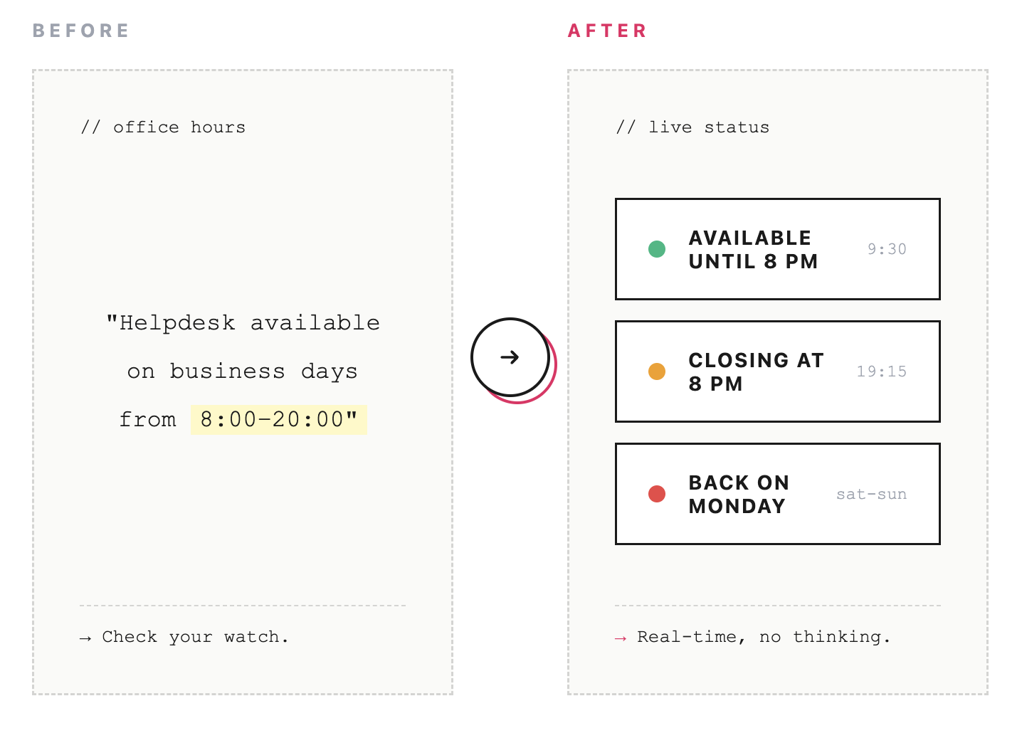
Previously, users had to compare opening hours with the current time on their own. I introduced contextual status labels such as:
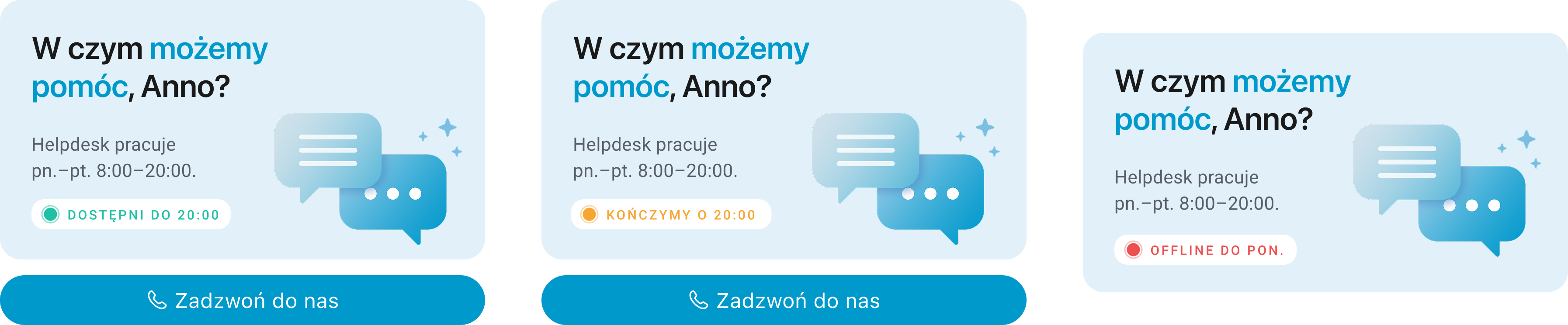
Real states
This small UI pattern reduces uncertainty before the user decides whether calling support makes sense.
The Help tab gives users a faster way to answer repetitive questions without contacting support. Expandable FAQ items keep the page compact, easy to scan and suitable for mobile. The goal was not to replace human support, but to create a first layer of help for common, repeatable situations.
The feedback flow was separated from the main contact page and designed as a more encouraging experience. Instead of presenting feedback as a generic form, the screen explains why the user’s opinion matters, keeps the input simple and shows what happens after submission. This creates more trust and makes sharing an idea feel like participation in product improvement, not like sending a support ticket.
The Contact tab brings together the most action-oriented information: support availability, a direct call CTA, online channels, location and opening hours. The hierarchy is intentionally simple: first help, then alternative contact paths, then operational details.
The Help tab introduces a self-service layer for common questions. Instead of forcing users to contact support for every issue, FAQ items allow them to quickly check answers in context and expand only the information they need.
Feedback was separated from the contact structure and introduced as a dedicated action: “Masz pomysł?”. This keeps support and product feedback from competing with each other, while still making idea sharing visible and accessible.
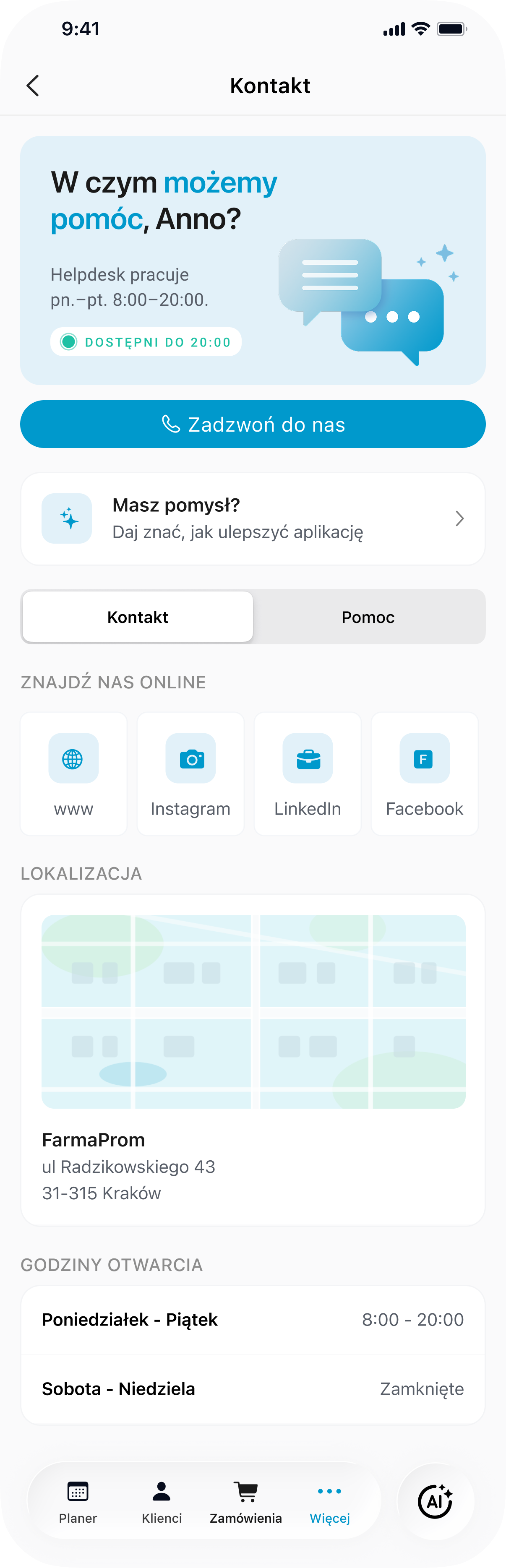
Direct support and company information are grouped in one clear, scannable contact view.
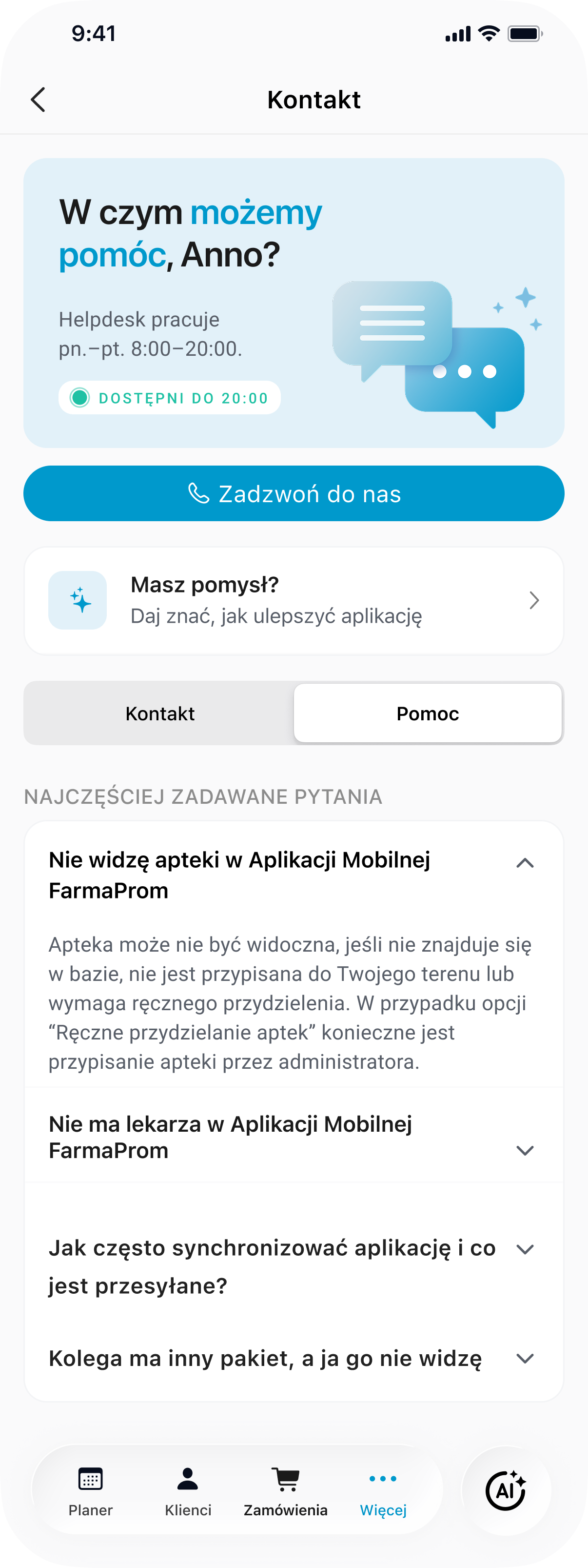
FAQ turns repetitive support questions into quick, self-service answers.
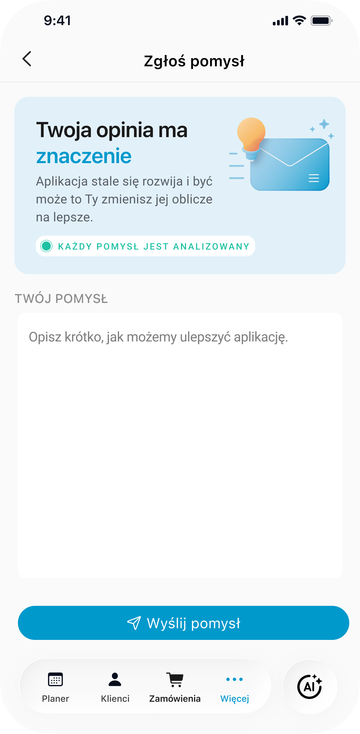
Feedback becomes a separate product conversation, not another support contact option.
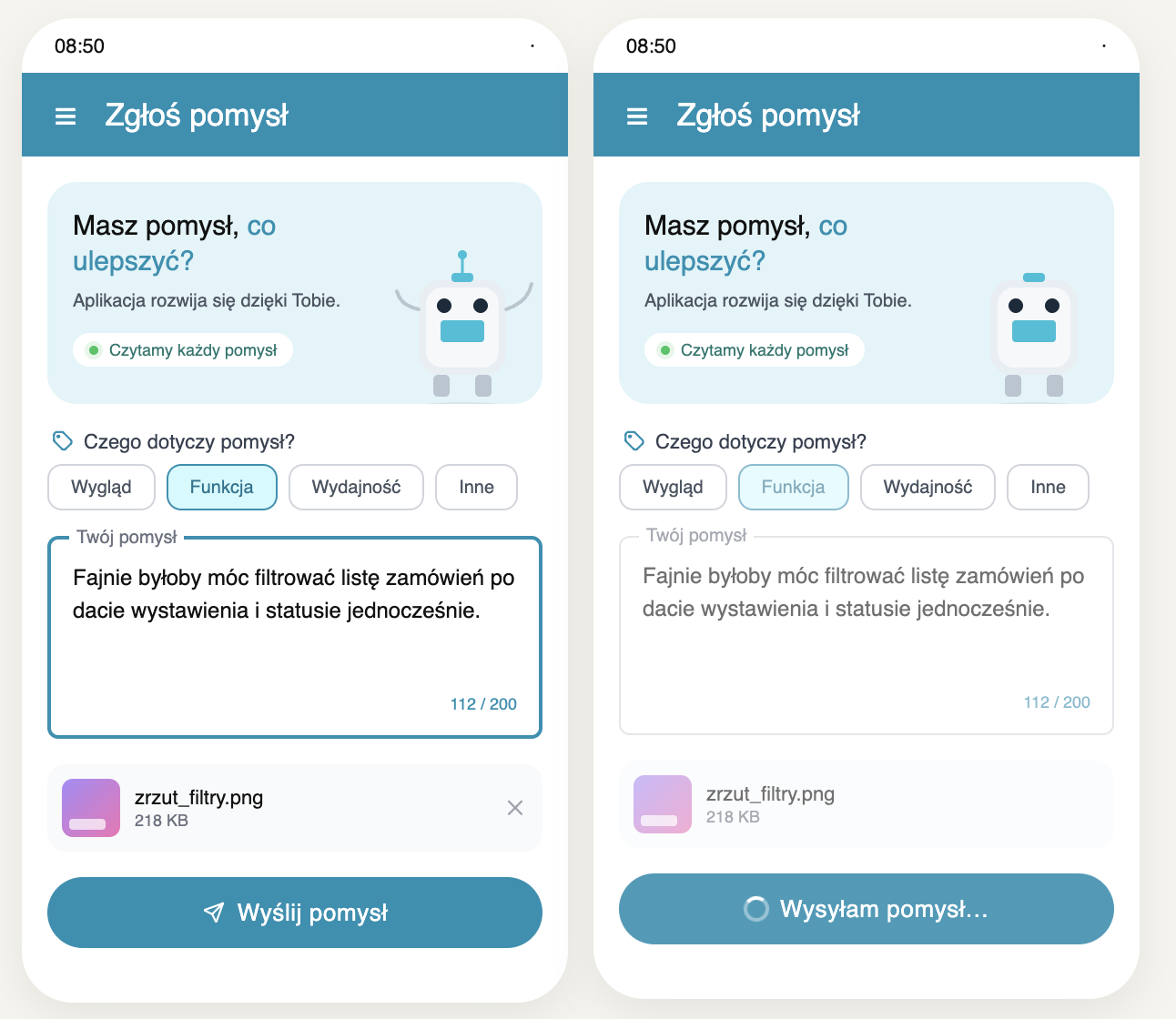
The feedback form focuses on one task: describing an idea briefly. The hero message explains the value of user input, the character counter sets expectations and the primary CTA keeps the action clear.
After submission, the confirmation screen makes the next steps visible: the idea was received, it will be analyzed and it may influence future versions of the app. This helps close the loop and builds more trust in the feedback process.
The error state keeps the user in control by offering two clear recovery options: try sending again or return to the form. The message is direct, but not blaming, which is important in moments of frustration.
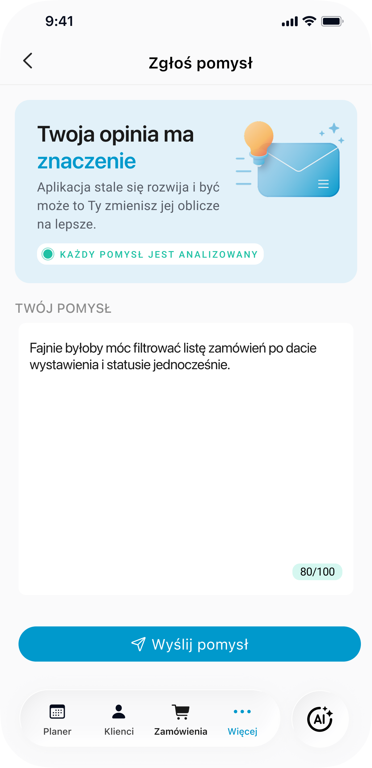
A simplified form lowers the effort required to share an idea.
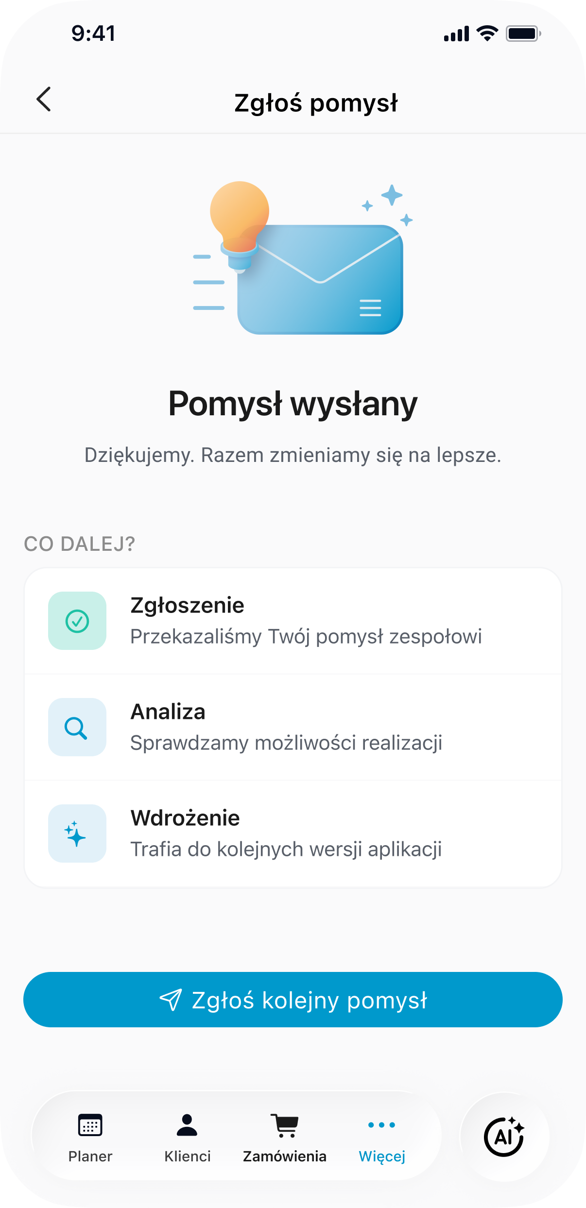
Showing next steps helps users understand that their feedback does not disappear into a black box.
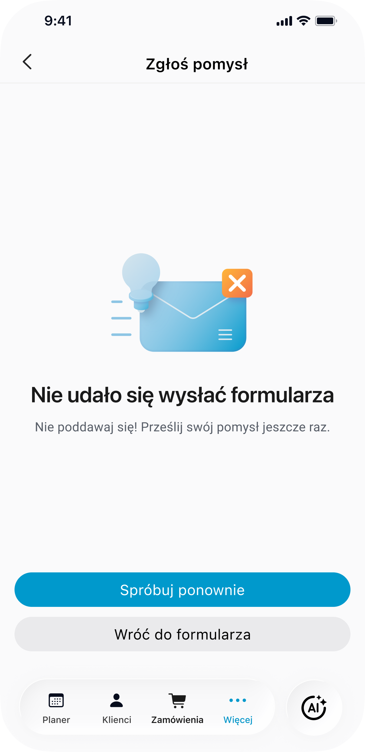
Error handling gives users a clear way to recover without losing confidence in the flow.
The redesign transformed the contact area from a set of static support screens into a clearer mobile support experience. The new structure separates direct contact, FAQ-based help and product feedback, making it easier for users to choose the path that matches their current need.
While no quantitative metrics were available, the redesign created a stronger foundation for support-related interactions: clearer information architecture, reduced uncertainty around support availability, a lightweight self-service layer and a more transparent feedback flow.
My main takeaway was that support areas should not be treated as secondary screens. Even small parts of a product can carry important user decisions, especially when users arrive there because they need help, clarity or reassurance.
← Back to all case studies