01
Problem
The existing menu had become visually heavy and difficult to scan. Important product areas were mixed into a long vertical structure, and the navigation did not clearly support different user contexts or growing product complexity.
Case 03 · MENU REDESIGN
Turning a dense legacy menu into a clearer, more scalable navigation system for different user roles, modules and workflows.
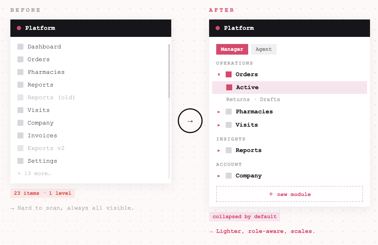
The product had grown over time, and the navigation no longer reflected how users moved through the system. My goal was to redesign the menu structure so that key areas were easier to find, the interface felt lighter, and the navigation could scale with new modules, roles and product directions.
The existing menu had become visually heavy and difficult to scan. Important product areas were mixed into a long vertical structure, and the navigation did not clearly support different user contexts or growing product complexity.
Create a clearer, more structured navigation system that helps users understand where they are, find key modules faster and move between product areas with less friction.
A redesigned navigation system with clearer product areas, lighter sidebar structure, dedicated landing pages for complex modules and responsive menu states across desktop and mobile.
UX/UI, IA, navigation redesign
Web app, responsive menu
Navigation structure, menu states and product clarity
The previous navigation worked technically, but it reflected the product’s history more than the user’s mental model.
As the platform expanded, more modules and actions were added to the sidebar. This made the menu harder to scan, especially for users who needed to move between different operational areas such as orders, pharmacies, reports, visits or company-related tasks.
The main challenge was not only visual redesign. It was about creating a navigation model that could handle product complexity without exposing all of that complexity at once.
Key issues in the previous experience:
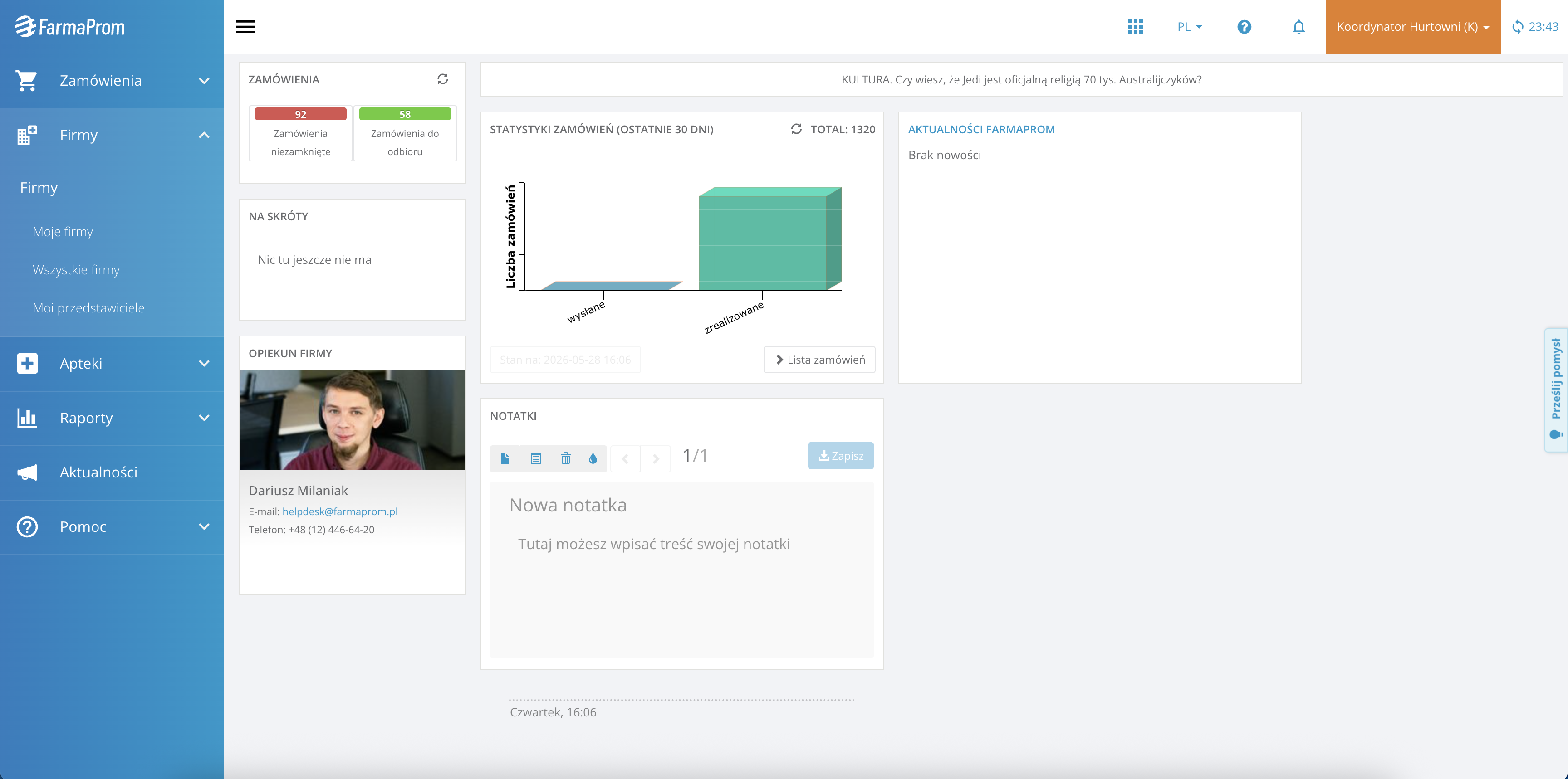
Before: The old menu exposed many product areas at once, making the navigation harder to scan and less flexible as the platform grew.
I approached the redesign as an information architecture problem first, and a visual redesign second. Instead of only refreshing the UI, I looked at how users move through the product: which areas are used frequently, which belong together, which actions should be immediately visible, and which utilities should be separated from the main workflow.
My work included reviewing the existing menu structure, grouping modules into clearer product areas, separating primary navigation from user settings and utilities, designing desktop, collapsed and mobile states, improving active states, hierarchy and scanability, creating scalable patterns for modules, categories and future additions, and keeping the design realistic for implementation and component reuse.
My front-end background helped me think about the menu not as a static sidebar, but as a system of states: expanded, collapsed, active, nested, mobile, role-based and responsive.
The biggest simplification was not about removing features from the product. It was about reducing how much complexity users had to process at once.
In the previous menu, many product areas and subpages were exposed directly in the sidebar. This made the navigation feel heavy and required users to scan through a long structure, even when they were looking for one specific workflow.
I simplified the model in three ways:
The menu now reflects user tasks instead of internal system structure.
Complex workflows were moved into dedicated landing pages.
Settings and helper actions were separated from daily product navigation.
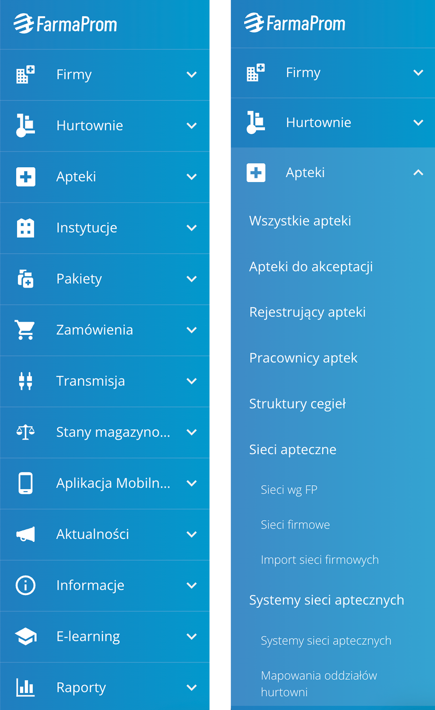
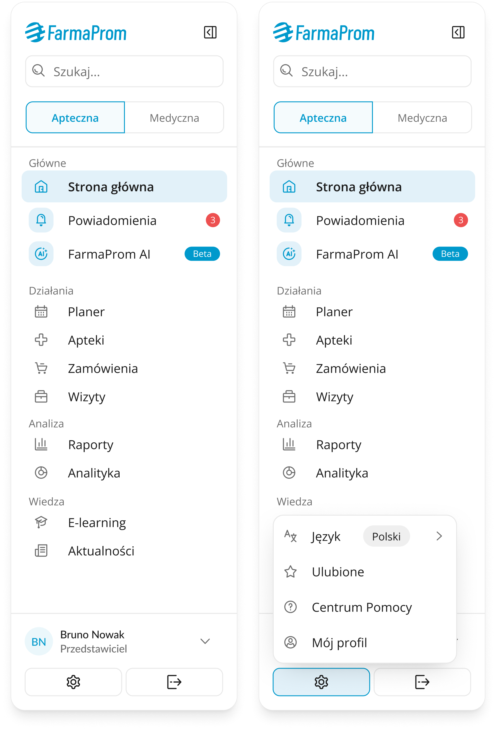
The old menu was based on a long sidebar with expandable sections. It gave access to many areas, but it did not clearly communicate structure or priority. The new navigation introduces a more organized model:
Primary navigation focuses on the most important product areas. Grouped sections help users understand what each area is for.
Utilities are separated from daily workflow navigation.
Mobile navigation becomes a clear full-screen menu instead of a compressed desktop pattern.
Category landing pages support complex areas like Pharmacies and Orders with structured entry points.
This changed the navigation from a list of links into a product map.
I focused on simplifying the navigation model, not only refreshing the interface. Each decision was made to reduce visible complexity, improve orientation and prepare the menu for future product growth.
Problem
The previous menu exposed too many product areas directly in the sidebar, making the navigation harder to scan as the platform grew.
Decision
I reorganized the structure around clearer product areas and grouped related workflows instead of keeping a long, system-driven list of modules.
Why it mattered
This reduced visible complexity and helped users understand the product structure faster, without needing to remember where every feature was located.
Problem
Complex modules such as Orders and Pharmacies contained many related actions, which made the sidebar longer and harder to maintain.
Decision
I moved deeper workflows into dedicated category landing pages, where related actions could be grouped into clearer sections.
Why it mattered
The main menu became lighter, while complex areas still remained easy to access and could scale without overloading the navigation.
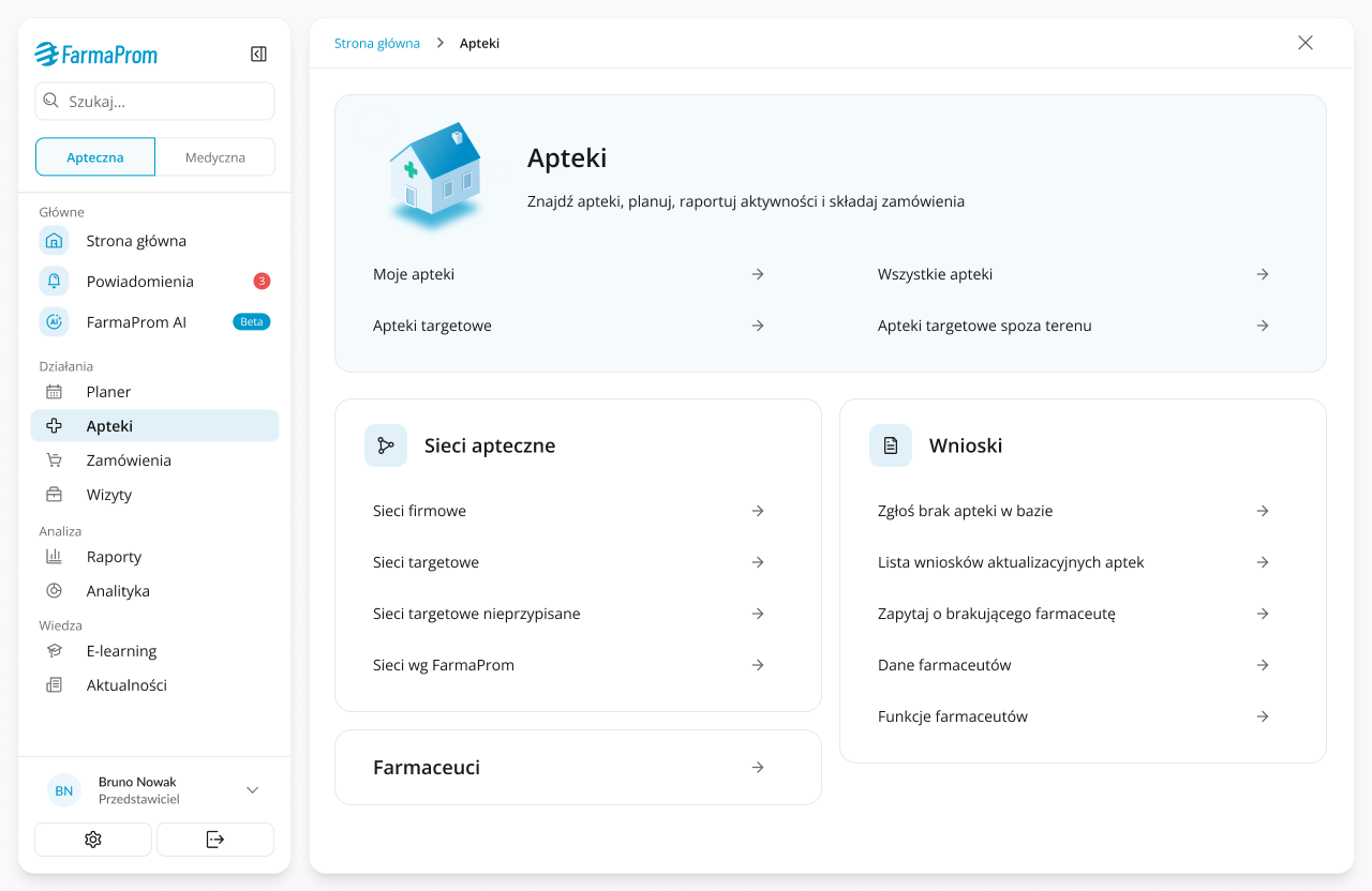
Dedicated landing pages made complex modules easier to scan without making the sidebar longer.
Instead of placing every subpage directly in the menu, I created category entry points that group related workflows into clear sections. This kept the sidebar lighter while preserving access to deeper product areas.
Problem
Primary workflows, settings and utility actions competed for attention in the same navigation space.
Decision
I separated daily product navigation from utilities such as language, favourites, help center, profile and settings.
Why it mattered
This made the navigation calmer and more focused, while keeping secondary actions accessible when users needed them.
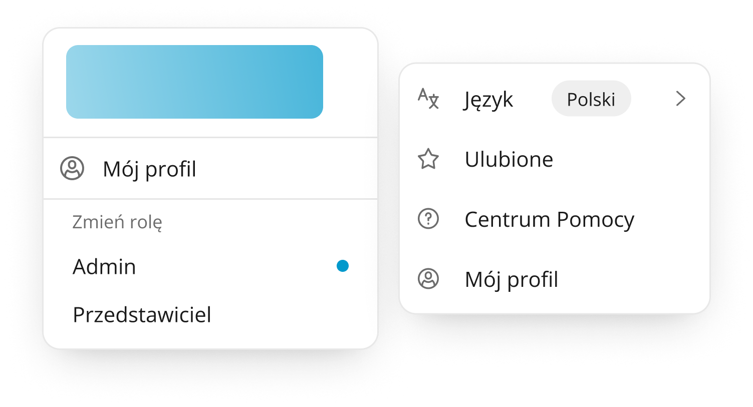
Utility actions were separated from primary workflows, making the menu calmer and more focused.
Problem
The menu needed to work across different states and screen sizes, not only as a full desktop sidebar.
Decision
I designed expanded, collapsed and mobile navigation states with consistent hierarchy, icons, active states and notification indicators.
Why it mattered
The navigation became a reusable product component that supports different working contexts instead of being only a static sidebar.
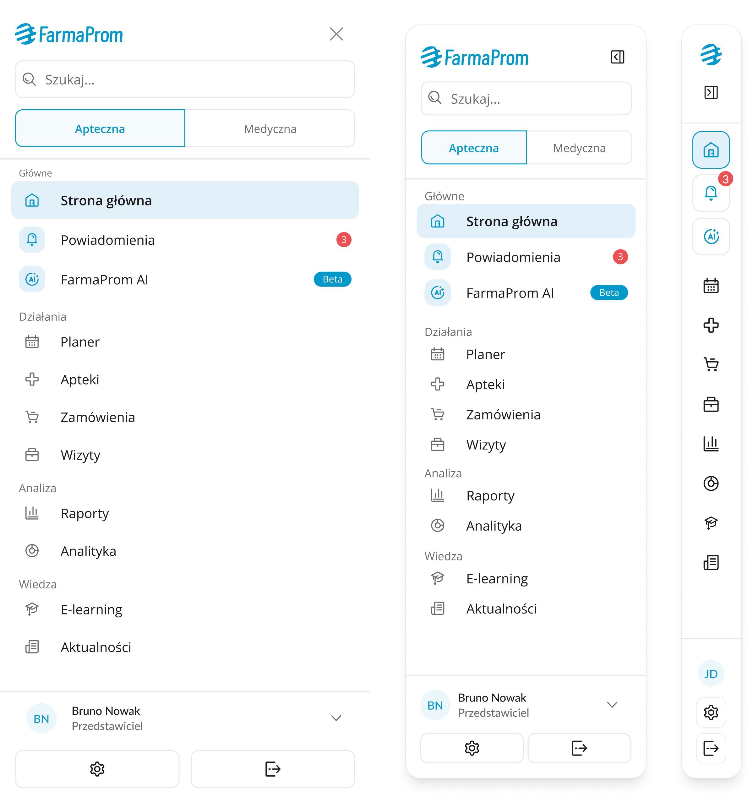
Expanded, collapsed and mobile states made the navigation more flexible across different working contexts.
The redesigned menu uses stronger grouping, lighter visual style and clearer active states. Main areas are easier to scan, and the layout gives users a better sense of where they are in the product.
The collapsed version keeps navigation available while giving more space back to the main content. Icons, active states and key indicators still support orientation without showing the full menu at all times.
The mobile version was not treated as a smaller copy of the desktop sidebar. It includes search, product context switch, grouped sections, notifications, AI entry point and user utilities in a layout that feels natural on smaller screens.
For areas like Pharmacies and Orders, I designed structured landing pages that act as entry points into deeper workflows. They group related actions into sections and reduce the need to expose every subpage directly in the sidebar.
The redesign was not limited to the sidebar itself. I also worked on smaller interaction moments that support orientation across the product: switching context, searching for features and browsing supporting content areas. These details were important because navigation is not only about the menu. In a complex product, users also need clear feedback when the system changes context, helpful shortcuts when they do not remember where something is located and consistent UI patterns across secondary views.
What changed
I added transition modals for switching between roles or workspaces, so users understand that the system is preparing a different product context.
Why it mattered
In a role-based system, changing context can affect available modules, permissions and displayed data. The modal reduces uncertainty and makes the transition feel intentional instead of like an unexplained refresh.
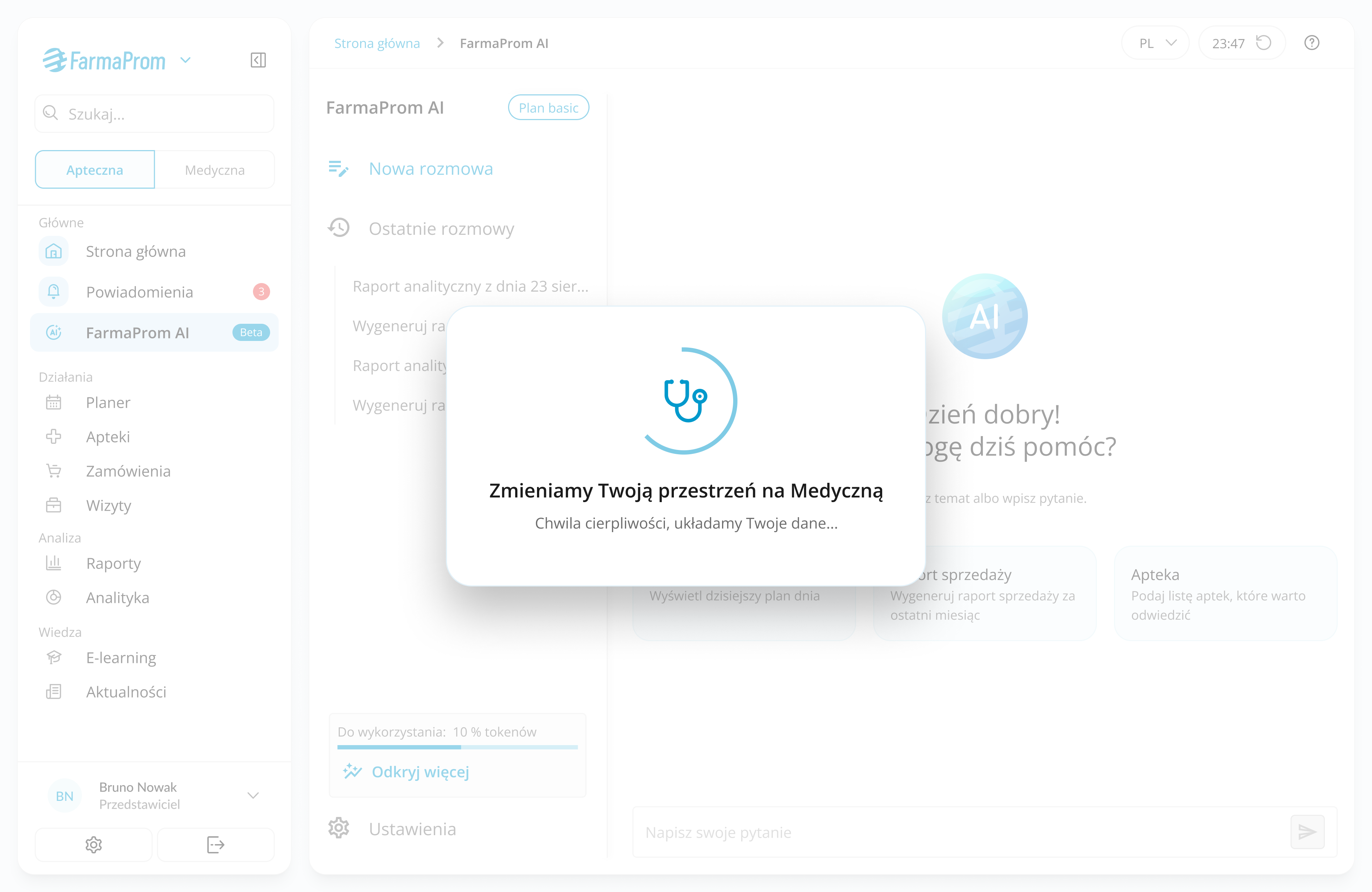

Role switching was supported with clear transition states, helping users understand that the system is loading a different workspace, not simply refreshing the screen.
What changed
I designed search suggestions, recent searches, recently viewed items, result states and empty states.
Why it mattered
Search became a second layer of navigation, helping users find features faster when they do not remember where something lives in the menu.
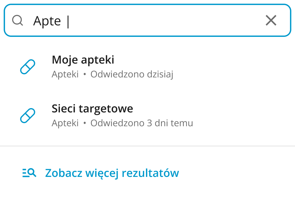
Search suggestions, recent items and empty states help users find product areas faster and recover when a query does not return results.
What changed
I refreshed supporting areas such as the News view with clearer cards, spacing, hierarchy and a more consistent visual style.
Why it mattered
The redesign felt more coherent beyond the menu itself, and secondary product areas became easier to scan and browse.
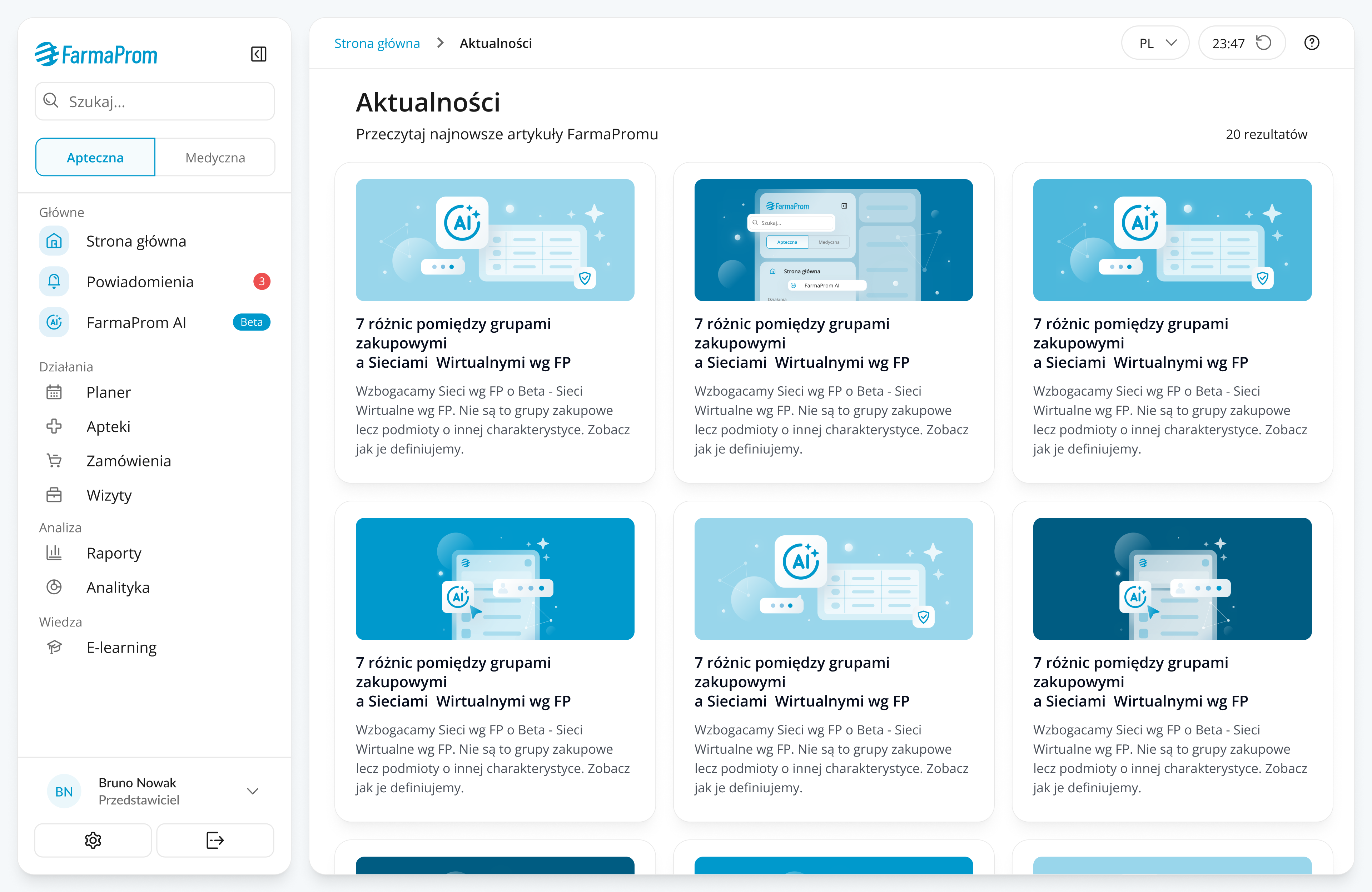
The redesigned News view uses clearer cards, spacing and hierarchy, making content easier to browse and more consistent with the new UI direction.
Because navigation affects many parts of the product, I validated the direction with the internal Help Desk team. The goal was to check whether the proposed structure aligned with real user questions, common navigation problems and support cases they observed in daily work.
This was not a full usability study with end users. It was an internal qualitative review with people who had strong operational knowledge of how users search for features, where they get lost and which areas generate repeated questions.
The review helped refine the grouping logic, confirm the value of separating primary workflows from utilities and identify which complex areas needed clearer entry points instead of more sidebar items.
Because navigation is a core product component, the redesign needed to account for more than the default expanded state.
Key considerations included:
My front-end background helped me think about the menu as a flexible component system: states, hierarchy, responsive behavior, reusable patterns and implementation constraints had to work together.
The redesign created a clearer and more scalable navigation foundation for a complex pharma platform. Instead of adding another visual layer on top of the existing structure, the project improved how the product is organized, how users move between areas and how future modules can be introduced without making the interface heavier.
The result was not only a cleaner interface, but a simpler navigation model that reduced visible complexity, improved orientation and created a more scalable structure for future modules.
Navigation is often treated as a supporting element, but in complex products it becomes part of the product strategy. A good menu does not only help users move between screens it explains the product.
← Back to all case studies